What's your color personality? Whether you prefer vibrant, saturated shades or lean towards neutrals, there's a hot fall hue just for you.
Cooler fall days are the perfect time to refresh your home with new colors. So, to go bold or not to go bold? The choice is yours. Read on to discover some of our favorite ways to use the freshest hues, from warm neutrals to cool, saturated shades.
A featured shade on Pantone's fall color report, Cognac is the design equivalent of a cozy blanket: A dose of this color lends warmth to everything from headboards to walls to bedding.
Take a cue from Scandinavian design: Greet cooler temperatures and shorter days with a coat of fresh white paint. Adding white on the walls or the ceiling will reflect the available light around your space, taking advantage of every last ray of sunshine.
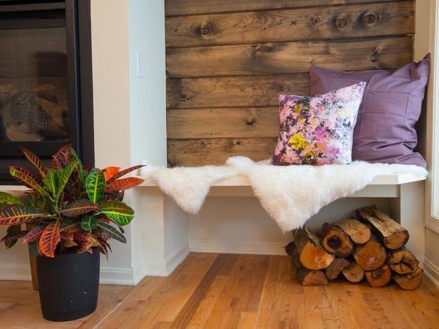
This pale pink-purple color is a romantic addition to a fall living room or bedroom. The warm, nearly-neutral shade pairs well with deeper purples, natural wood tones and whites, as seen on HGTV's Cousins Undercover.
This warm, inviting shade of gray featured on Pantone's fall color report is reminiscent of weathered barn wood. Pair it with reds, yellows and shades of gray for a fall-perfect combination.
A muted, softer shade of summer-favorite bright yellow, this slightly green color featured in Pantone's fall color report is a cheerful addition to a kitchen, dining room or living room.
Pantone's color of the year transitions seamlessly into fall when paired with deeper purple shades, light browns or deep blues.
This plummy purple makes a bold statement — perfect for a dining room or entryway. Cover a whole room with sangria-hued paint or patterned wallpaper, or take a more conservative color approach with a floral throw pillow.
Walking the line just between orange and red, this color is evocative of an autumn maple leaf. Pair it with more shades you'll spot on the fall landscape — think deep reds, yellows and gray-browns — for a can't-miss seasonal update.
This color is cool and bright all at once. Another color featured on Pantone's fall fashion color report, this shade is a natural with its color-wheel opposite, orange. A dose of white balances the saturated mix.